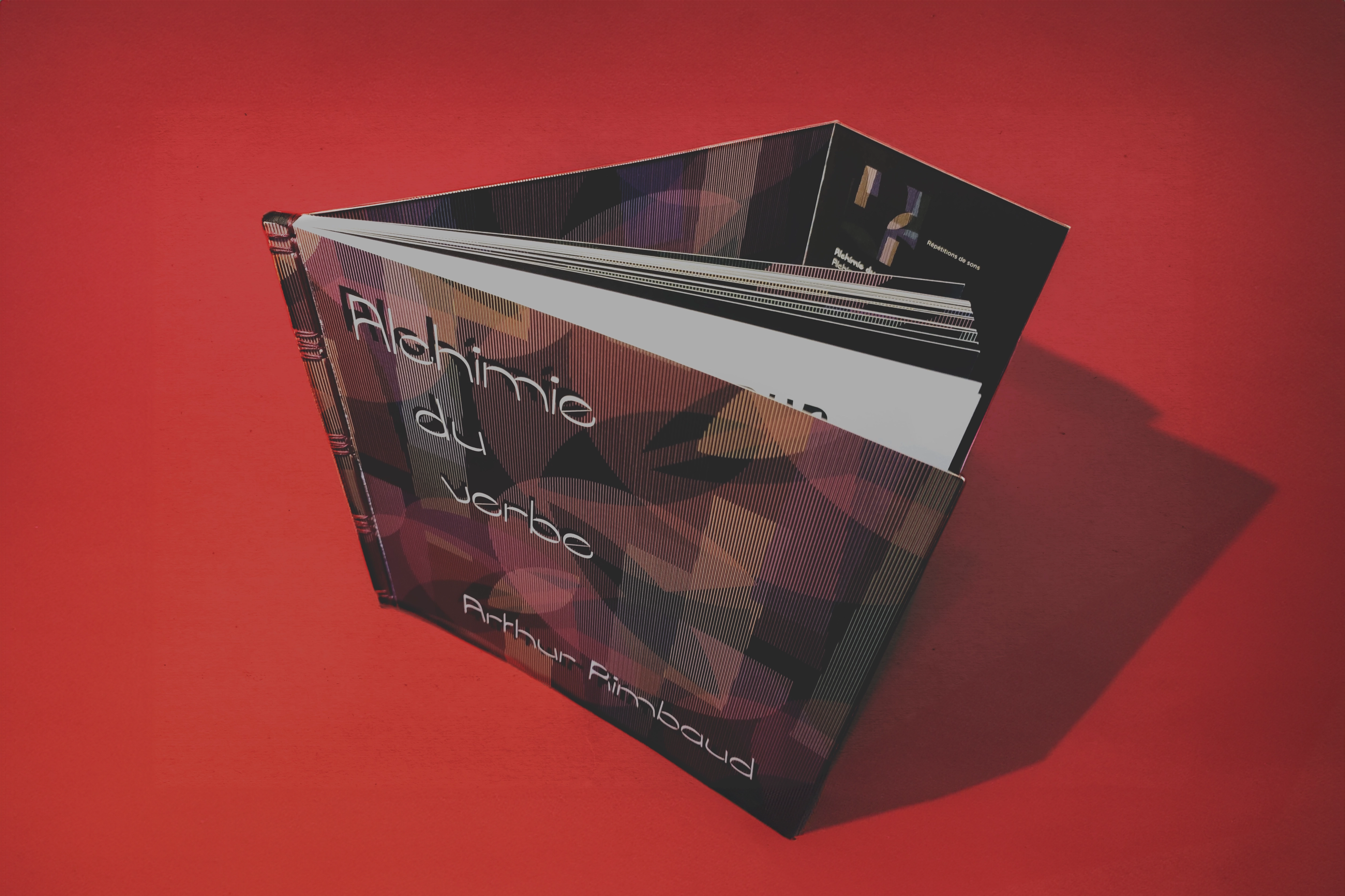
Alchimie du verbe
Type design & editorial design
This project is based on Arthur Rimbaud's poem “Alchimie du verbe” (Alchemy of the Word). It highlights the author's poetic techniques through typography. Poetry is often perceived as impenetrable, so this project aims to make poetry more accessible by visually translating poetic writing techniques. Aimed at a non-experienced audience, this edition can also be used as an educational tool.
Two typographic concepts were developed to illustrate key aspects of the anthology:
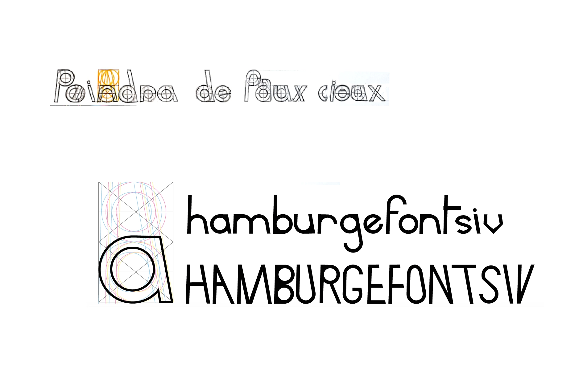
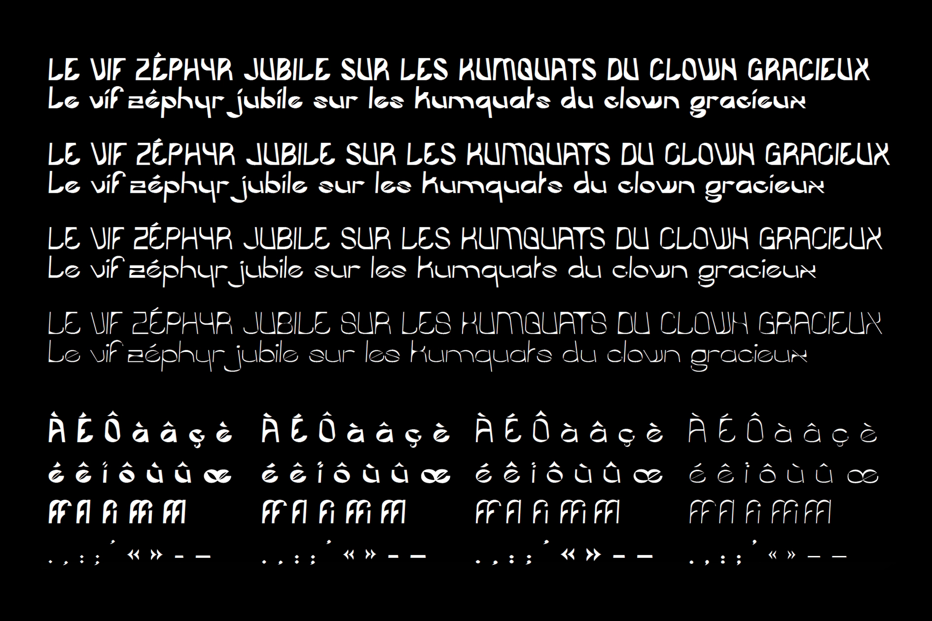
Temporal shift: inspired by the contrast between Rimbaud's past and present “self,” this first concept uses linear geometric shapes with slanted stems and blackened serifs. The decision not to correct optical distortions creates a visual shift, recalling Rimbaud's desire to “adjust the form and movement of each consonant.”
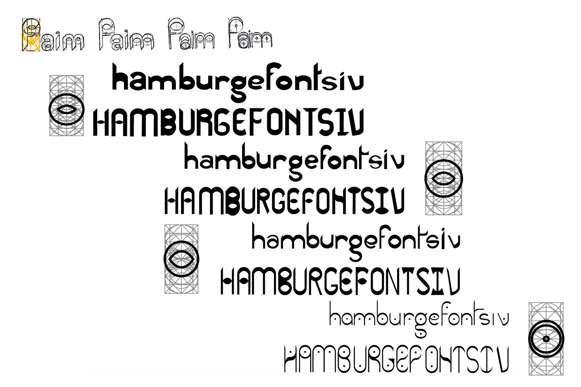
The ideal of the visionary poet: This second concept reflects Rimbaud's evolution throughout the story. The eye of the letters gradually opens with poetic revelations, then closes in the face of the failure of his project. The more the eye opens, the more the letters become thinner.
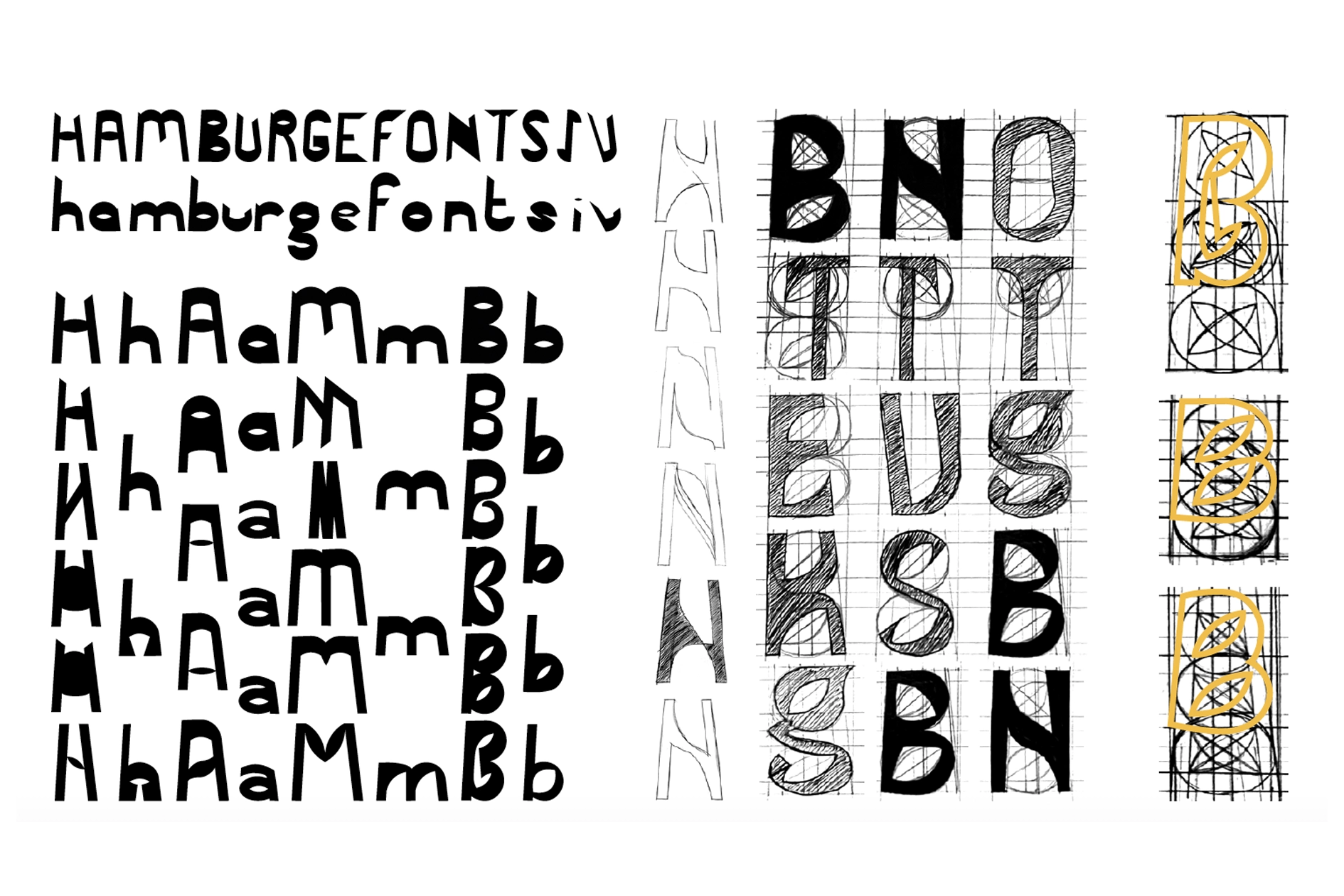
After in-depth analysis, these concepts were merged to create a cohesive typeface capable of reflecting all the characteristics of the poem.
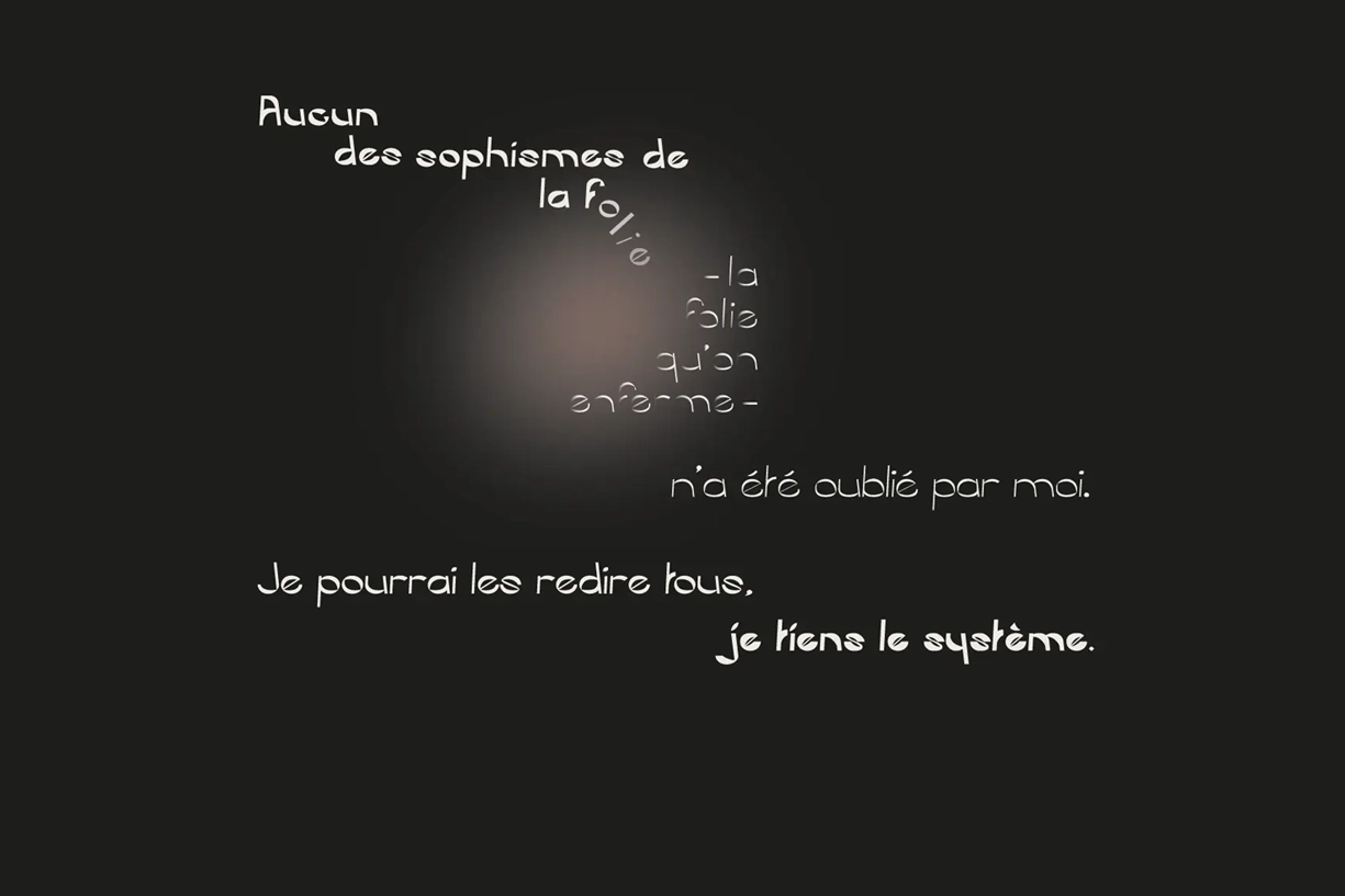
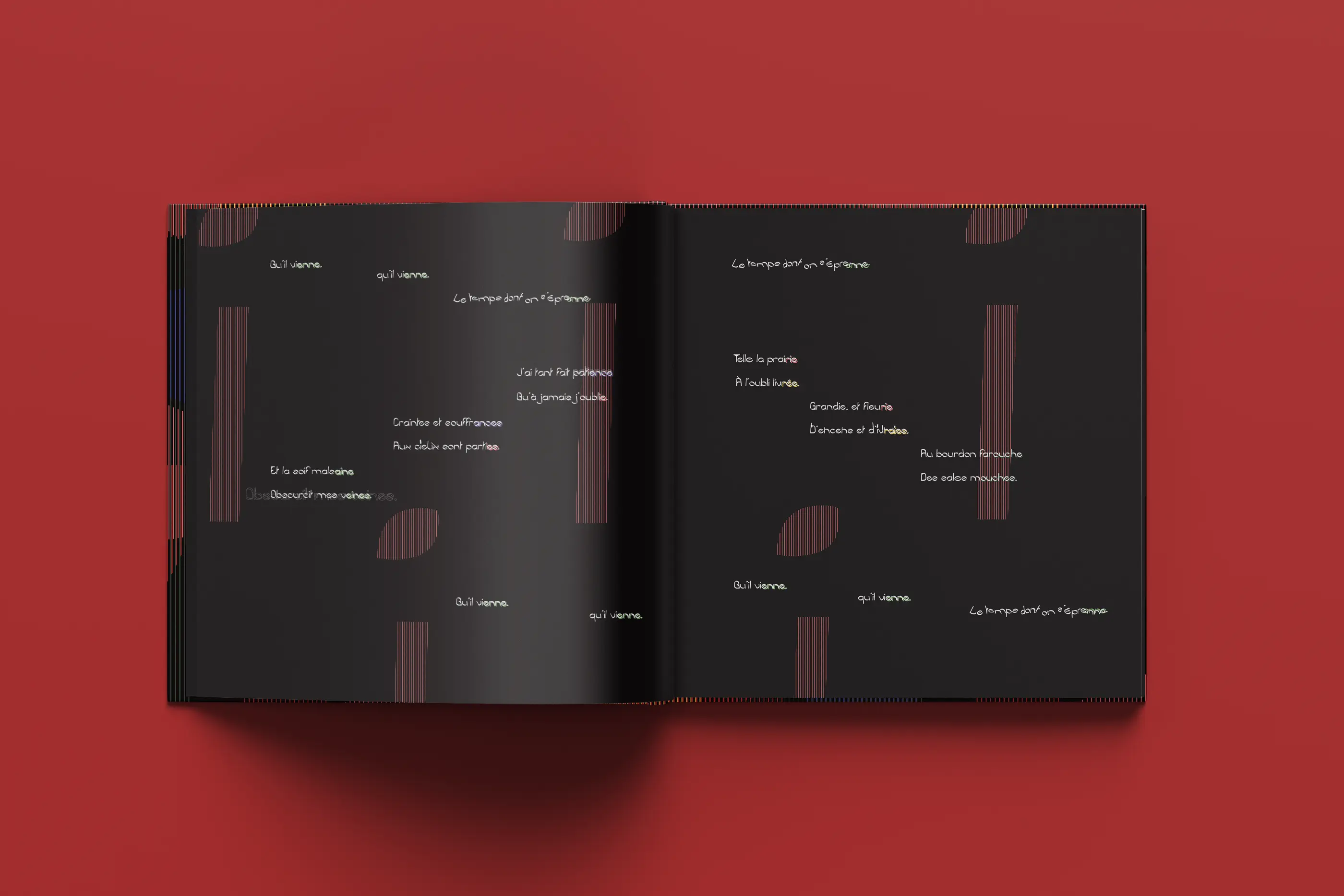
The layout follows a square format to reflect the cyclical nature of the poem and emphasize symmetry, allowing the words to create the lines of tension. Margins separate the poem from reality, following the tradition of Baudelairean poetry.
The text is laid out according to Mallarmé's principles of visual poetry, with adjustments to suit Rimbaud's specific style.
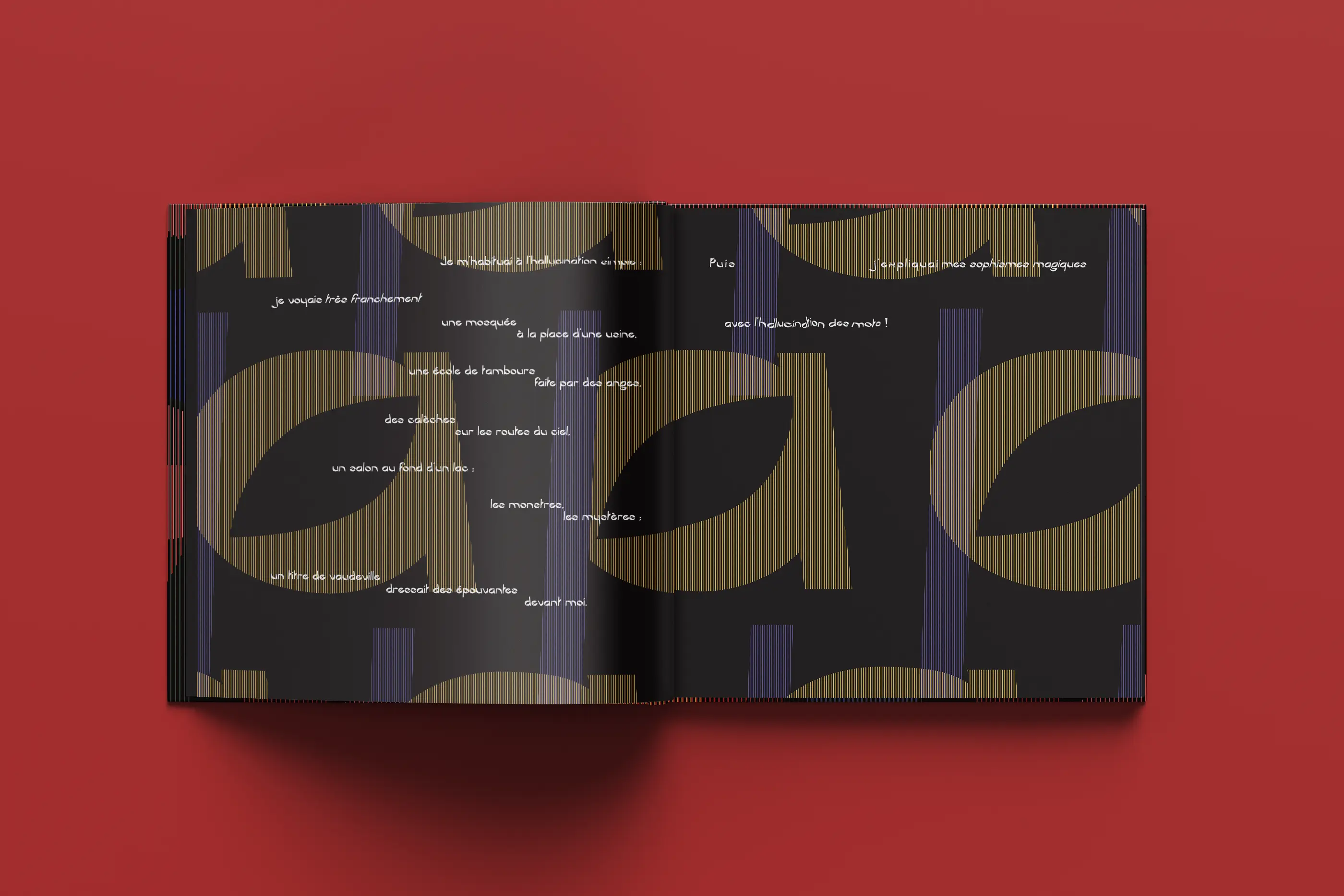
Colors play a crucial role in highlighting the sound repetitions (assonances and alliterations) characteristic of Rimbaud's poetry. The letter pattern uses warm colors for assonances and cool ones for alliterations. This visually dominant mechanism is essential to do justice to the poem's rich soundscape.
Japanese binding was used to make the book's structure visible, echoing the details of the poem's structure. The patterns on the spine echo the use of patterns in the text layout.