Label Pêche
Branding
Label Pêche is an independent music label that champions pure expressiveness, without limiting itself to musical genres. With a strong motto – “Fuck genres, emotions are all that matter” – its visual identity had to embody this philosophy: minimalist, striking, and full of energy.
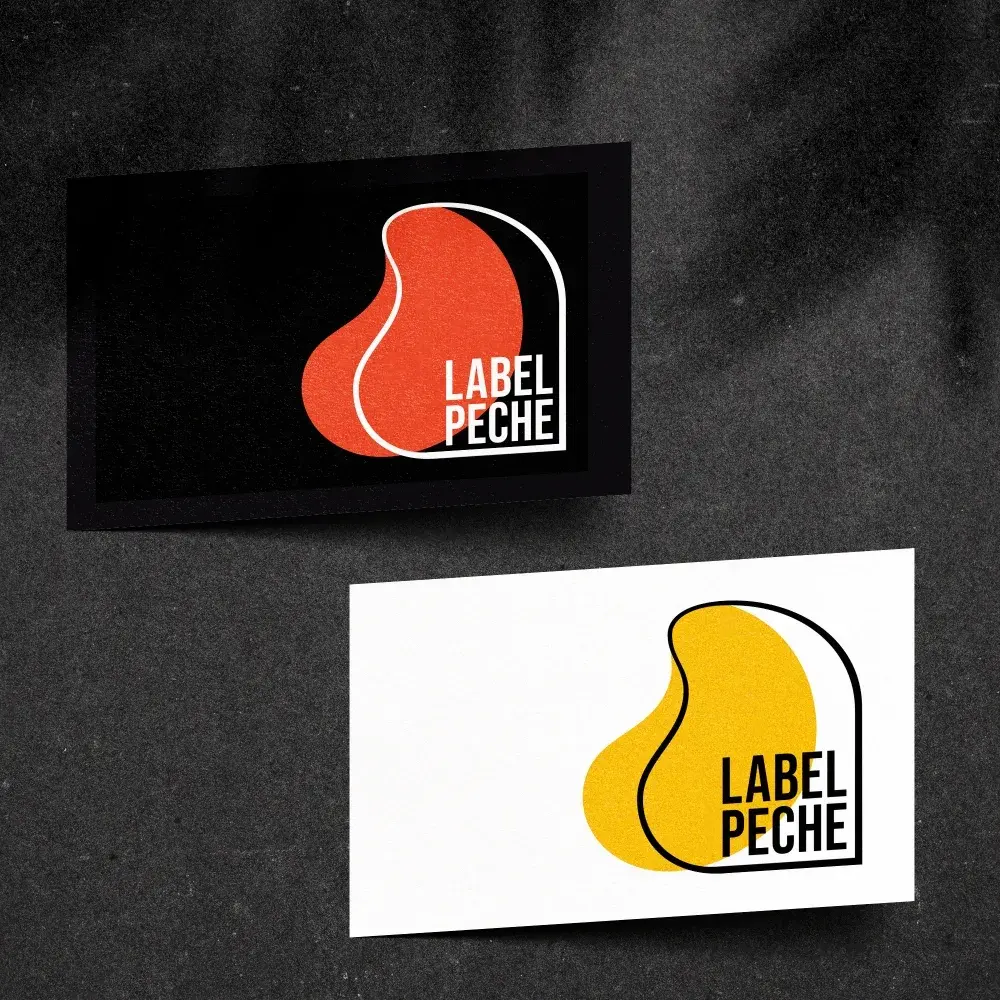
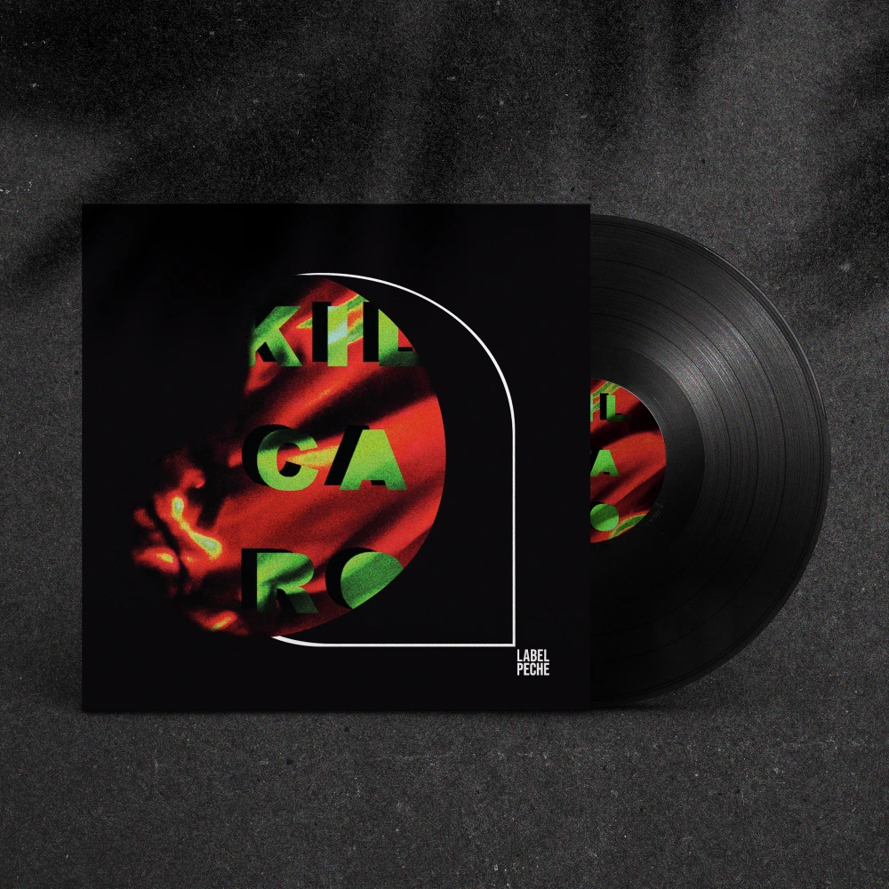
To translate this vision, I designed a visual identity that plays on organic shapes and bright colors, while maintaining a graphic simplicity that emphasizes the essentials. The logo, inspired by the silhouette of a peach, was adapted into several versions to suit all contexts. The soft curves and vibrant palette (red, yellow, green) reflect the label's vitality and boldness, while remaining instantly recognizable.
The vivid and contrasting color palette enhances the visual impact and perfectly matches the label's mission: to put emotions at the heart of music. The color variations allow for maximum flexibility, whether on a light or dark background, while maintaining strong consistency.
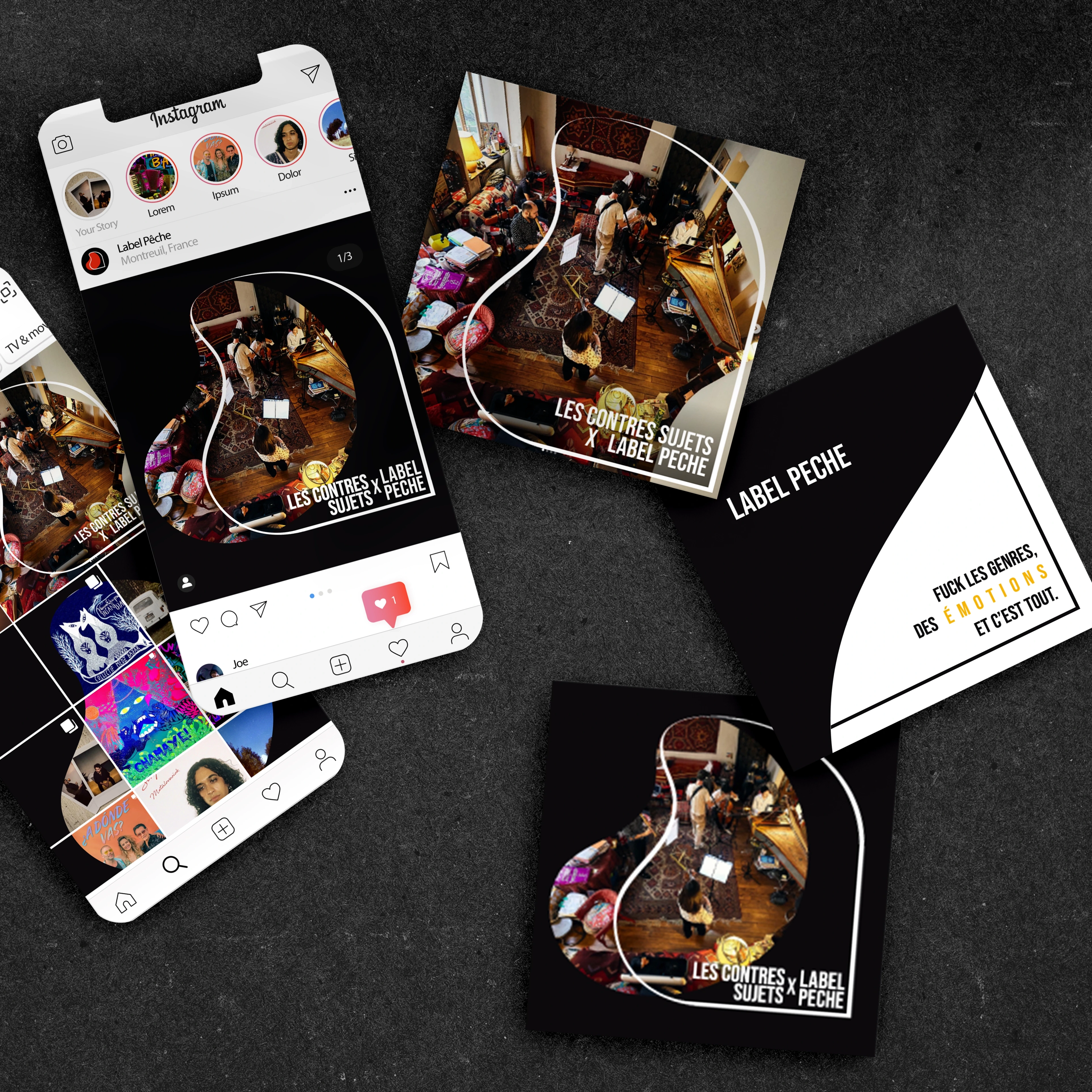
This identity is applied across a variety of platforms, from business cards to vinyl sleeves and social media posts. Each element has been designed to capture attention and convey Label Pêche's message with clarity and purpose.
Promotional materials, such as Instagram posts, were designed to maximize the label's visibility. The visuals, both minimalist and expressive, reflect the essence of Label Pêche: music free from convention, where emotion takes precedence over everything else.
This project demonstrates how a bold and consistent visual identity can strengthen the presence of an independent label. Thanks to a modern and flexible design, Label Pêche now communicates its message with strength and clarity, asserting its place in the music industry.