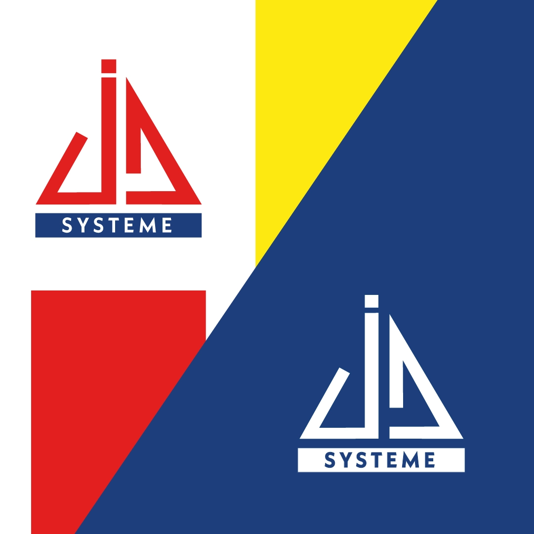
JD Système, a specialist in tile installation accessories, has undertaken a rebranding project while retaining their original logo. The goal was to refresh the company's image by creating a modern and cohesive visual identity, incorporating vibrant colors and dynamic graphic elements.
Development of Visual Identity
• Enhanced Original Logo: JD Système's logo has been subtly adjusted to better align with the new visual identity. These changes maintain the essence of the original logo while adding a contemporary twist.
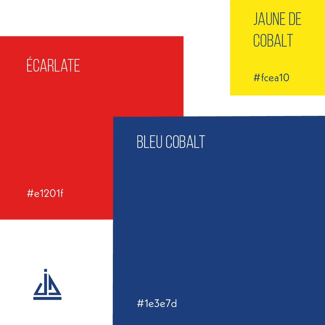
• Color Palette:Inspired by Mondrian's artwork, the new color palette features bright tones that echo the geometric shapes of tiles. These energetic colors catch the eye and breathe new life into JD Système's visual identity.
• Layout Elements:The layout utilizes simple geometric shapes, such as triangles and rectangles. The triangles represent JD Système's flagship products, like the screw-in spacers, while the rectangles refer to the tiles themselves. This approach enhances the brand's coherence and visual recognition.
This rebranding effort modernizes JD Système's image while staying true to its core values. The new colors and patterns introduce a fresh visual appeal and increase the company's visibility in the tile installation accessories market, helping JD Système stand out from its competitors.


