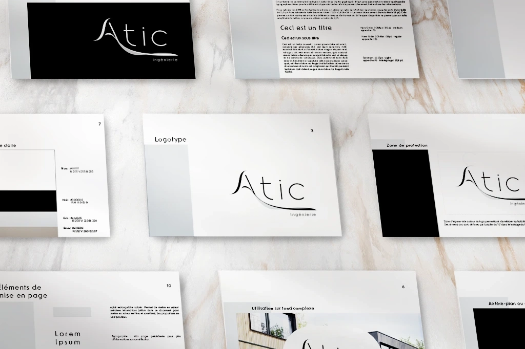
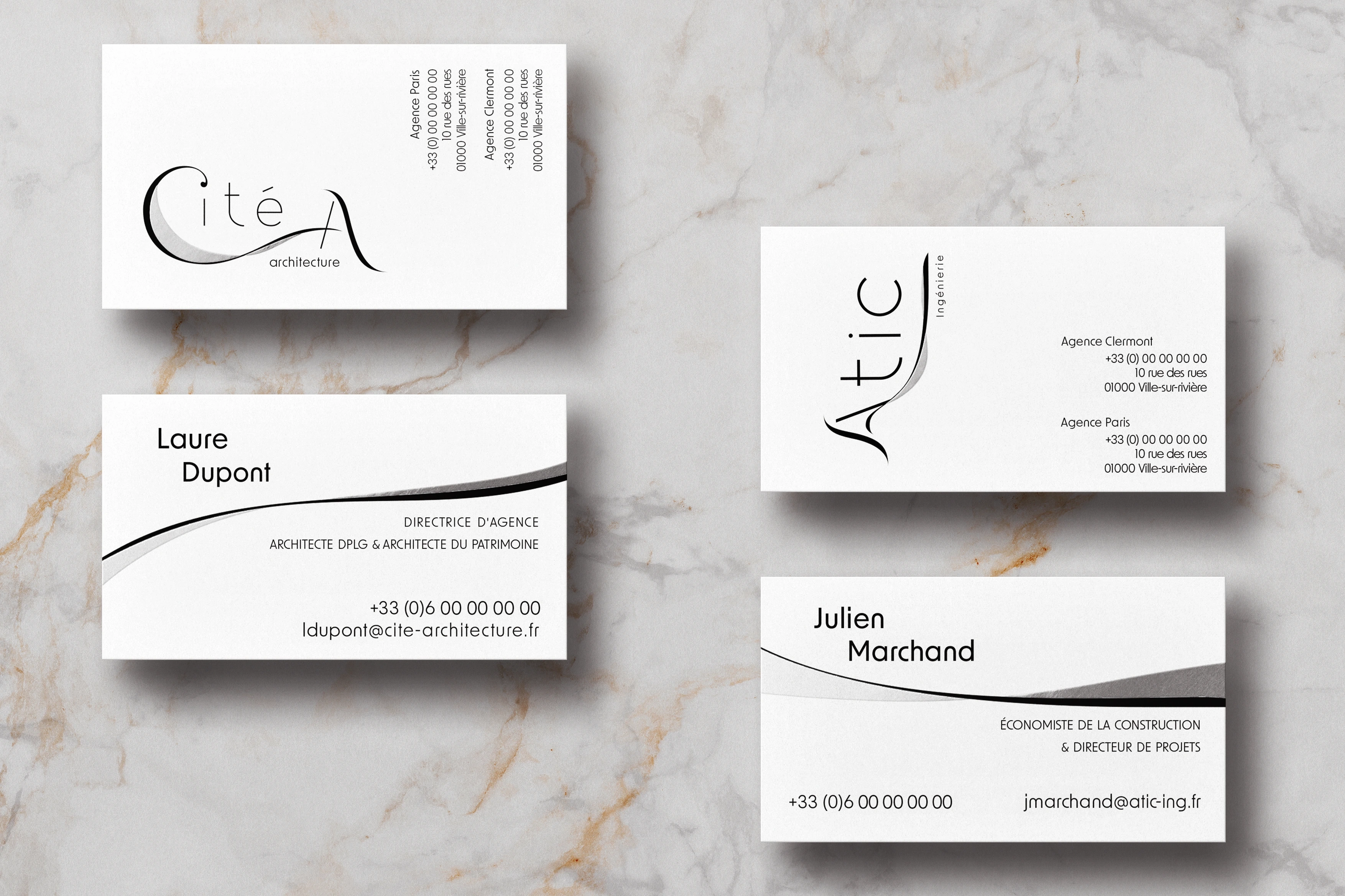
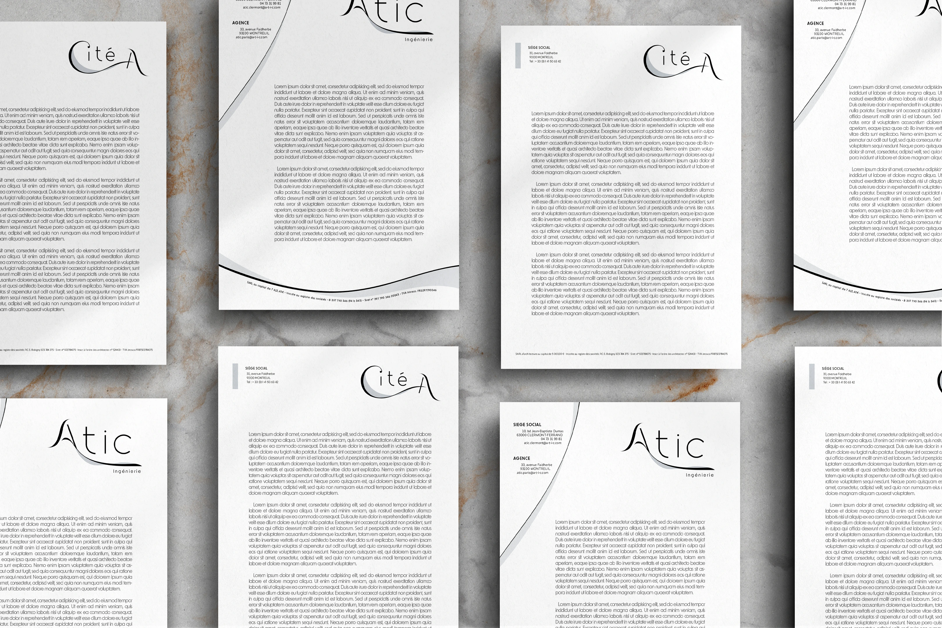
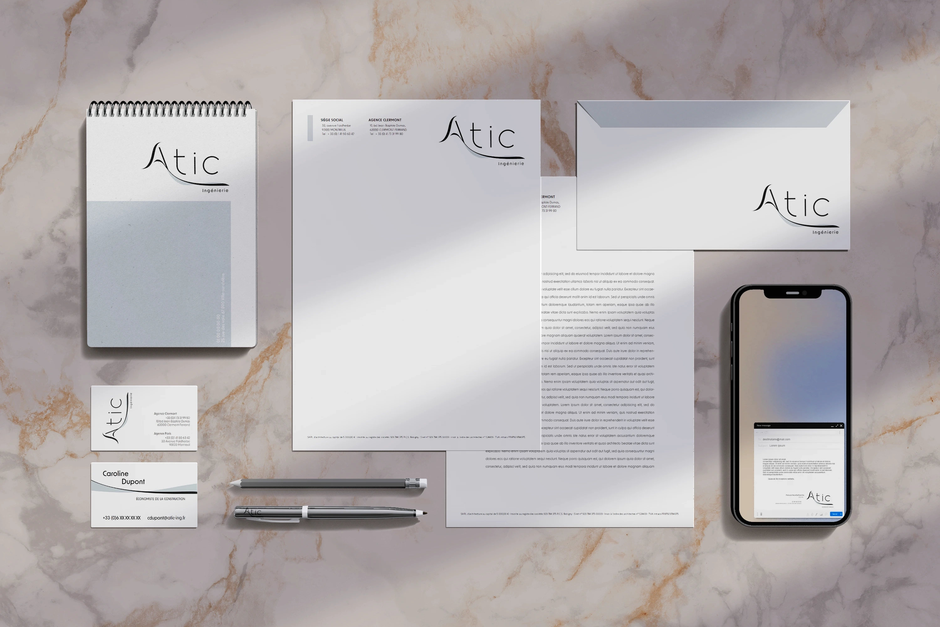
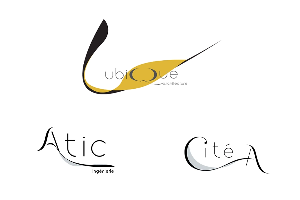
This project involves creating a new visual identity for Atic and Cité A, two sister companies recently incorporated into the Ubique group, which specializes in project management. Atic is a technical consultancy, while Cité A is an architecture firm. The goal was to reflect the unity and synergy between these three entities through a coherent and harmonized rebranding.
Visual identitty
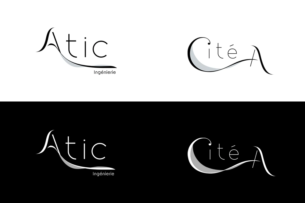
The logos for Atic and Cité A were redesigned to incorporate similar graphic elements, including fluid curves and harmonized typography. These elements create visual cohesion between the two companies while reflecting their specific fields.
This visual identity project for Atic and Cité A illustrates the importance of a coherent and harmonized approach in rebranding, especially when multiple companies are involved.
Drawing inspiration from Ubique's identity, this rebranding successfully creates a strong visual synergy, reflecting the connections and collaboration between the companies
