Atic & Cité A
Rebranding
This project involved creating a unified visual identity for Atic and Cité A, two companies recently integrated into the Ubique group, which specializes in construction management. Atic, a engineering firm, and Cité A, an architecture firm, needed to share a common identity while retaining their specific identities. The challenge was to embody their unity and complementarity within the group, while reinforcing their individual identity.
To achieve this, the Atic and Cité A logos were redesigned to incorporate common graphic elements: fluid curves and harmonized typography, inspired by Ubique's visual identity. These choices create strong visual cohesion between the three entities, while allowing each company to retain a distinct identity tailored to its area of expertise.
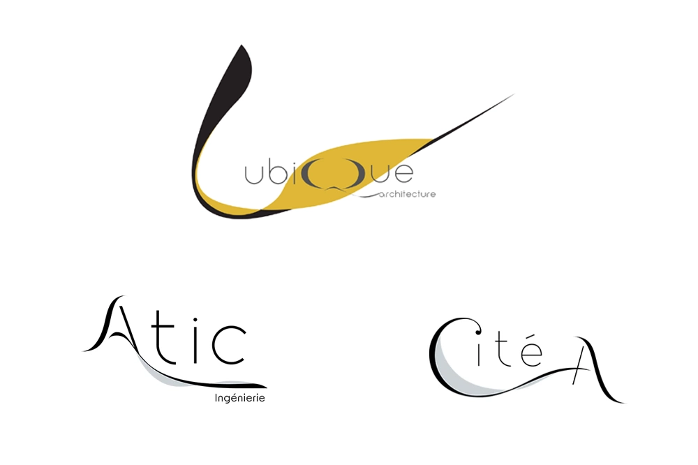
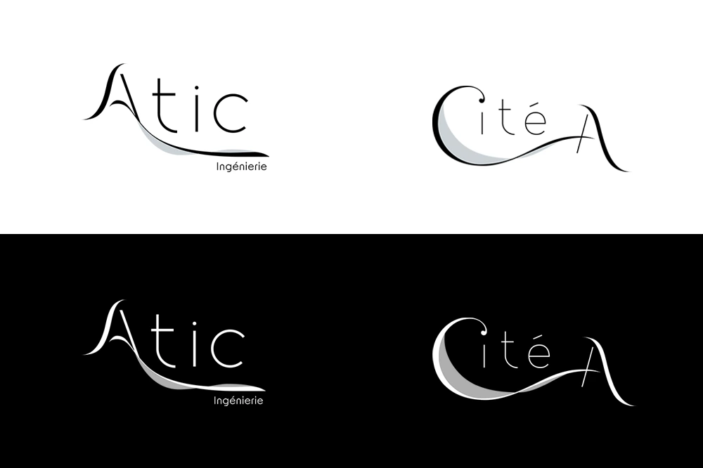
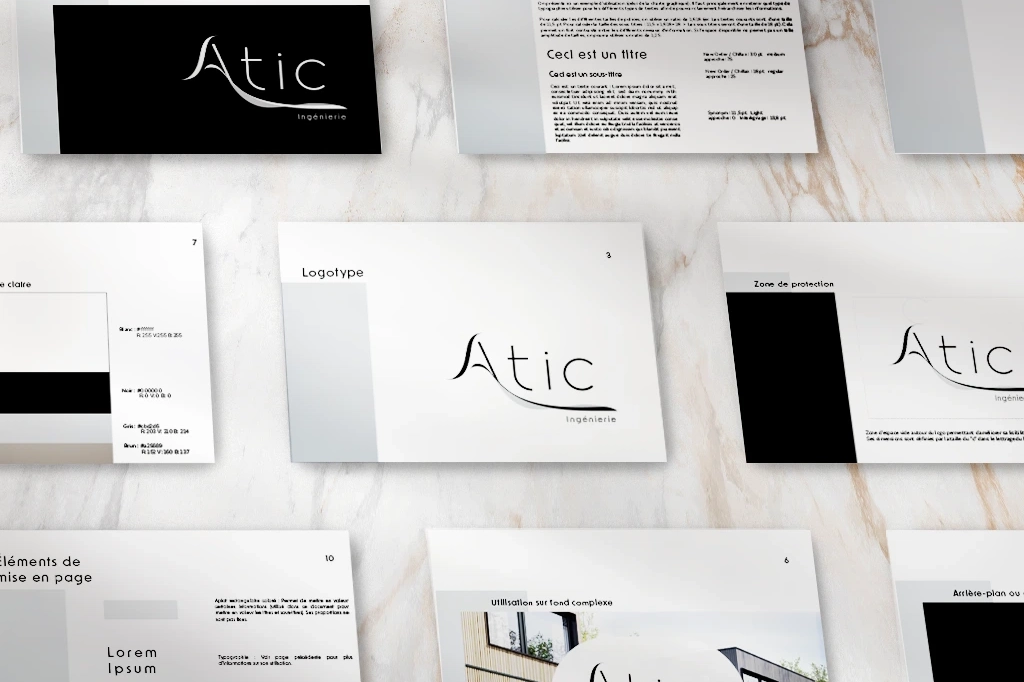
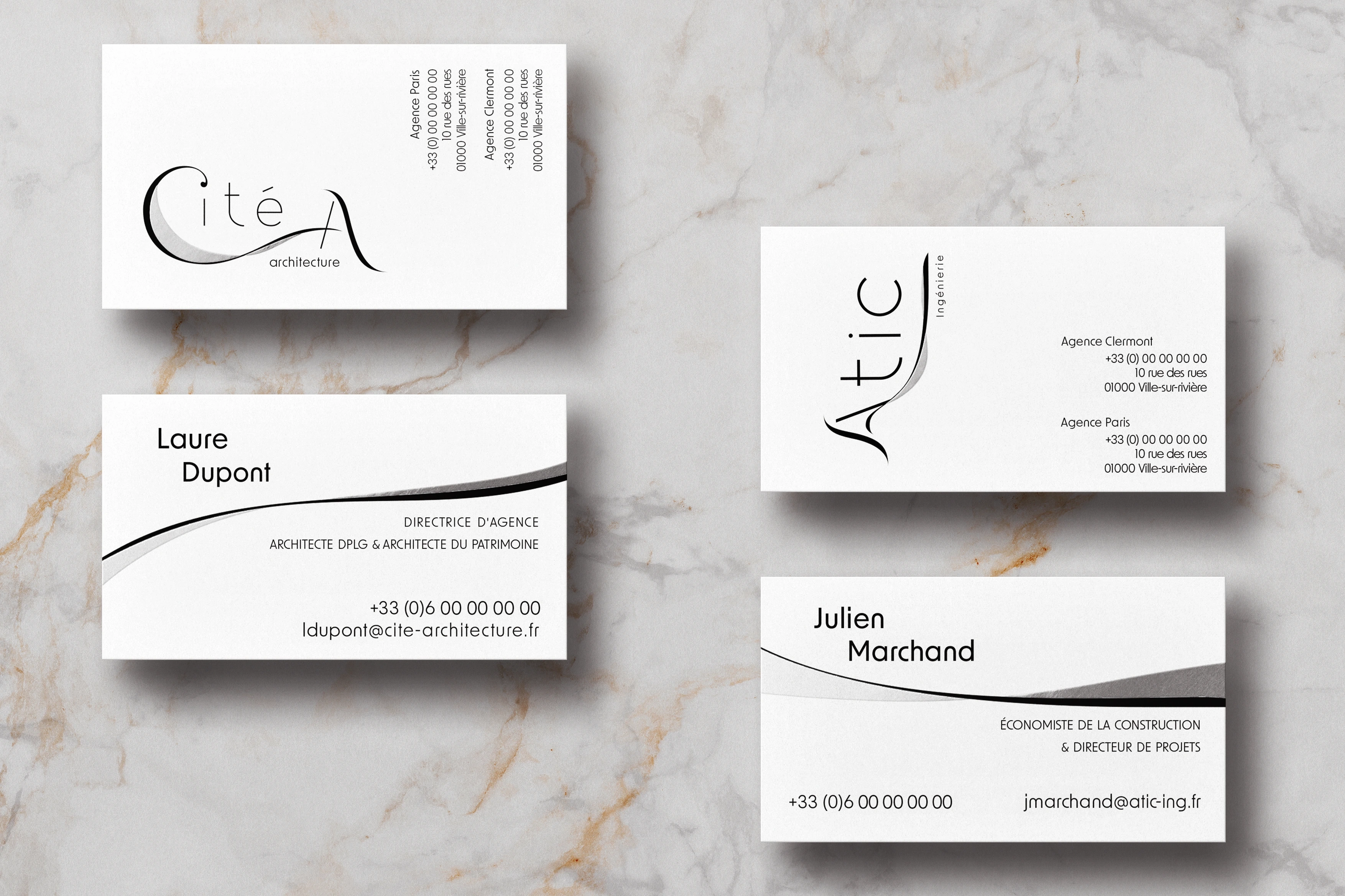
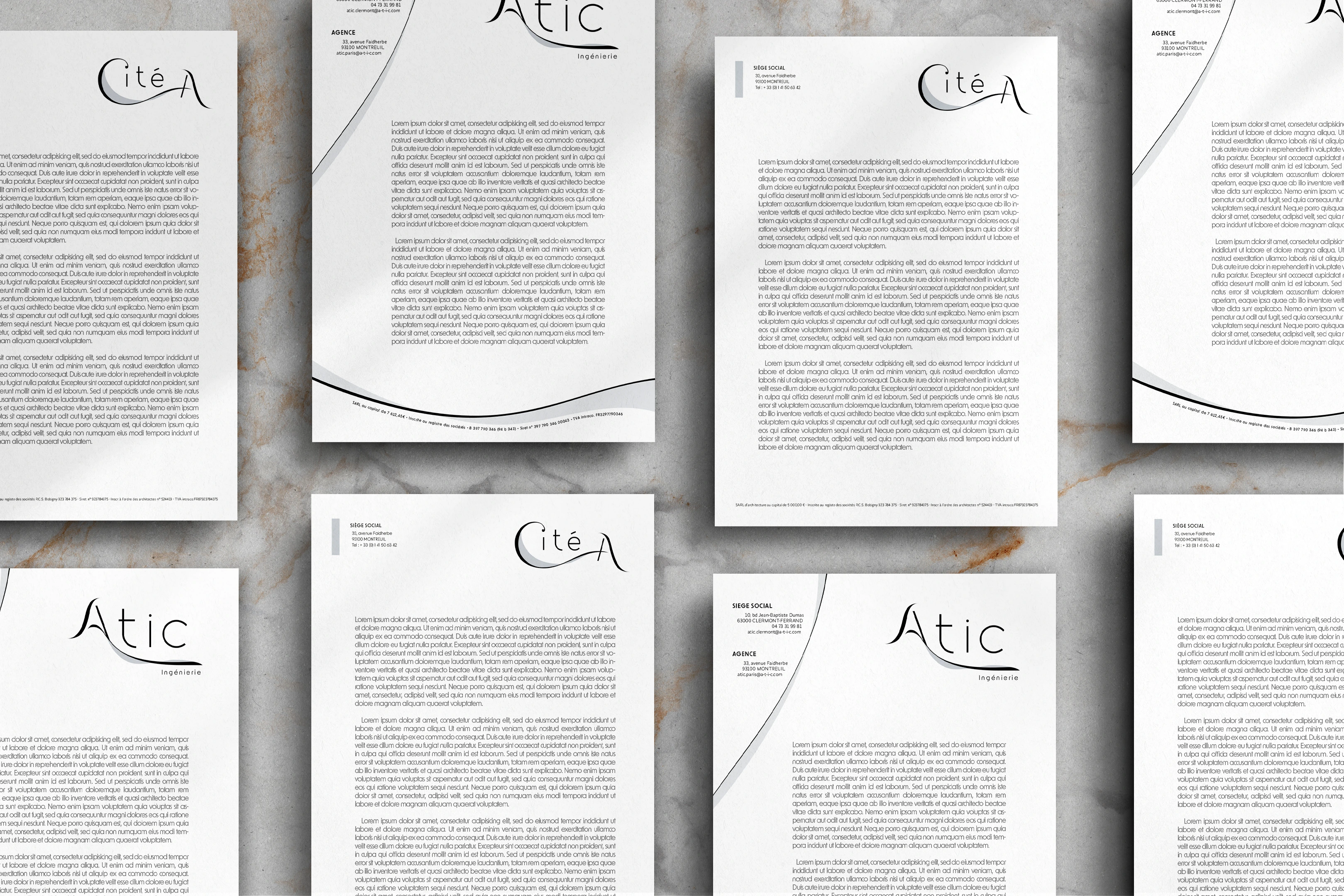
The brand guidelines were designed to ensure consistent application across all formats, from business cards to stationery. The shared curves and typography reinforce immediate recognition of the group, while the color variations and graphic details clearly distinguish Atic and Cité A.
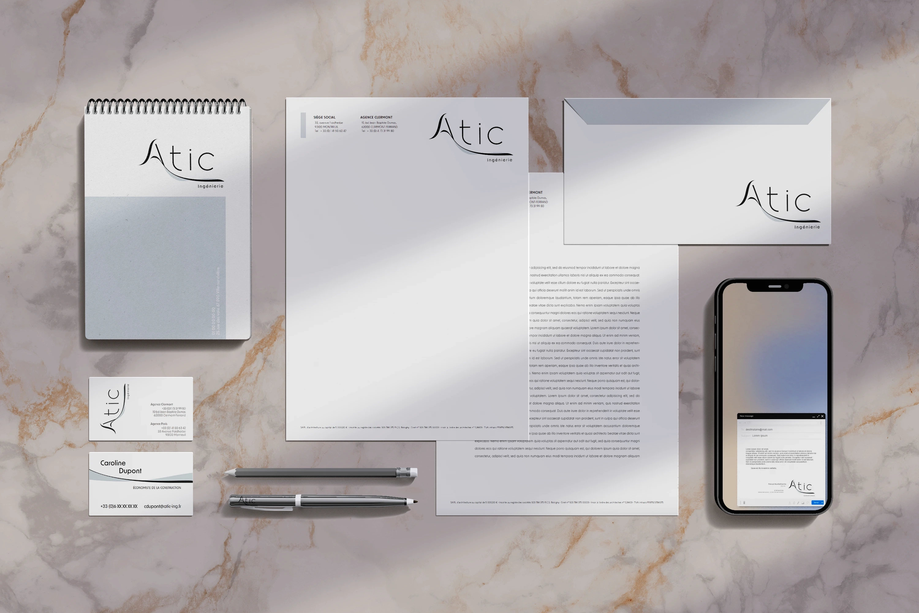
Business cards and letterheads have been designed to make it easier to identify the two entities, while emphasizing their affiliation with Ubique. Each element now reflects visual synergy, while remaining tailored to the specific needs of each business line.
This rebranding demonstrates the value of a consistent approach when multiple companies are merged under one corporate identity. By building on Ubique's identity, the project successfully created a strong visual connection between the three entities while highlighting their respective expertise. The visual identity embodies both the unity of the group and the diversity of its expertise.